Image will appear shortly

Media Queries

22 november

What is a Media Query ?


Media query is a CSS technique introduced in CSS3.

It uses the @media rule to include a block of CSS properties only if a certain condition is true.


What is Responsive web design ?


When you use CSS and Html to resize, hide or shrink etc to make a website look good on any screen it is called Responsive web design.

The Features of css used to make the web content adaptive to different devices (to make responsive) are called Media Queries .

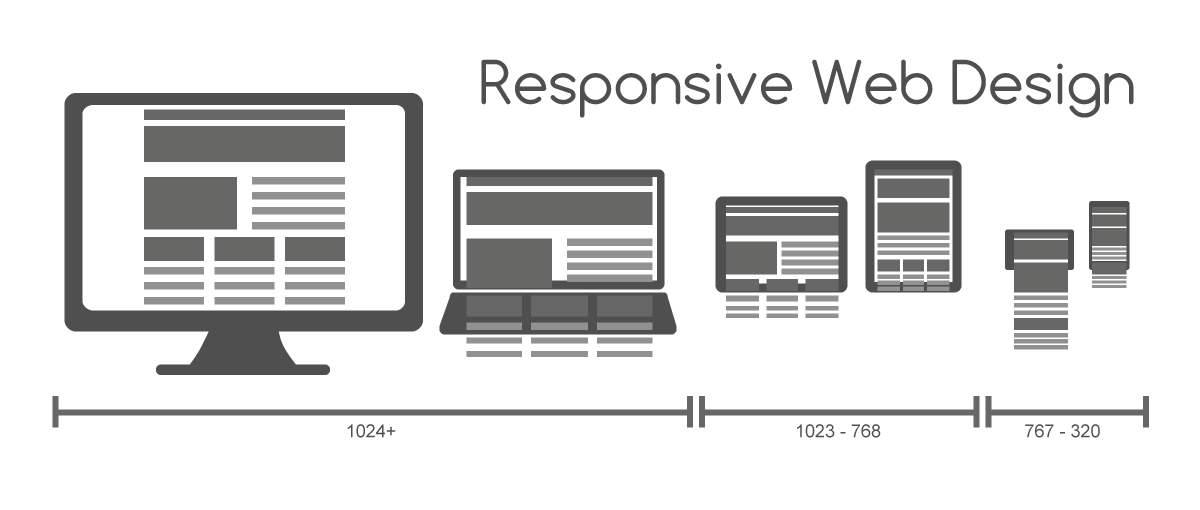
Web pages can be viewed using many devices like desktops, tablets and phones. Each device has its own unique resolutions and orientations so it becomes important for web pages to look good in all screen sizes, it should not leave out an information to fit smaller screen but it should rather adapt its content to fit in any devices.

Image will appear shortly


Why Media Queries ?


Media Queries allows us to add break points where certain parts of design will behave differently on each side of the break point.


How to use ?

They can be intialized in:

Syntax:

@media( media type ){
//code
}

Media type

media type can be defined as the device screen for which we are writing the code for.

In CSS we can target 3 type of media:

This blog discusses the Screen type only.


For Digital Screen:

Digital screen includes all types of device screen i.e Desktop, Tablet, Mobile etc.

Syntax:

@media media_type and Width{
//code
}

min-width:

For ex:

from min-width resolution to the infinite resolution the code or css will work.

@media screen and (min-width:800px){
#sidebar{display:none}
}


The above code will not display sidebar to screens with 800px and 800+ pxs

max-width:

For ex:

After the given max-width resolution the code or css will not work.

@media screen and (max-width:800px){
#sidebar{display:none}
}


the above code will not show the sidebar from 0px - 800px (as min-width is not given)

max-width and min-width:

We can use both together i.e we can give the desired start and end point.

@media screen and(min-width:320px) and (max-width:800px){
#sidebar{display:none}
}


above code will hide the sidebar from 320px - 800px


Thankyou for reading !!

Go Back Next